Loading...
Loading...
Loading...
Curated directory of the best AI tools, services, and resources for vibe coders. Discover new tools, compare options, and find exclusive discounts.
Simple, modular React component library with accessibility built-in
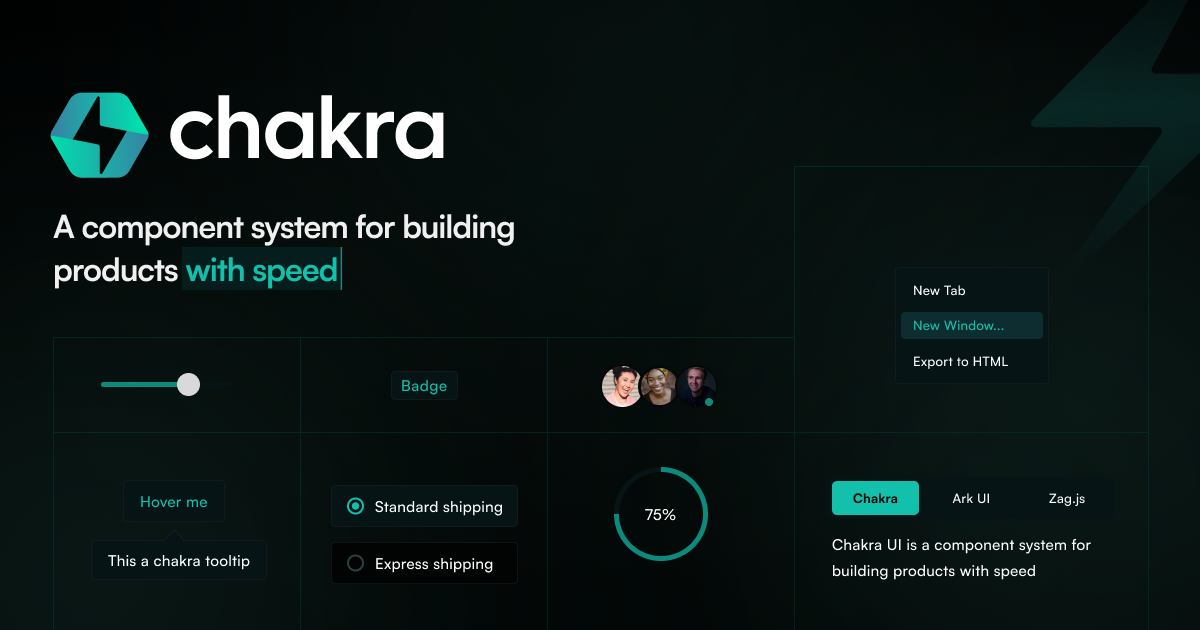
Chakra UI is a comprehensive React component library that provides developers with a collection of simple, modular, and accessible UI components for building modern web applications. The library focuses on developer experience and design consistency while maintaining strong accessibility standards out of the box. The component library offers a wide range of pre-built components including typography controls, form elements, navigation components, and layout utilities. Each component is designed with customization in mind, featuring a powerful theming system that allows developers to maintain design consistency across their applications. The library includes design recipes that make it easy to create component variants and customize styling properties. Chakra UI is particularly well-suited for React developers who want to build applications quickly without sacrificing design quality or accessibility. The library's modular architecture means developers can import only the components they need, helping to keep bundle sizes optimized. The comprehensive documentation and active community support make it accessible for developers of all skill levels. The library stands out for its focus on accessibility compliance, ensuring that all components meet WCAG guidelines by default. This makes it an excellent choice for teams building applications that need to meet accessibility standards without requiring extensive additional configuration or testing.